How to build a converting landing page
In most cases, a landing page is the best tool that can get a user from “I’m just browsing” state to a paying customer. Of course, there are creatives, headlines, targeting, and such that also do their bit, however, the landing page is the face of your campaign. Fail to be convincing — and you can bid adieu to those conversion rates. This is why just building a lander is not enough, you also need to test it out and fine-tune every element to create an orchestra playing “here comes the profit”.
There are some major points that you need to hit in order to make a landing page perform well. It needs to be: functional, accessible, usable, intuitive, and persuasive. We’ll break each of these qualities down in the following passages.
Functional

Concerning landing pages, functionality means their technical performance: for example, how well and how fast they load. There should be no glitches or bugs either, as this will interrupt the user experience and damage your conversion rate.
Loading speed is also crucial for your CR, as most users don’t like to wait for a page to load — they are more likely to switch to someone else’s offer in this case. You can monitor the speed of your landers here or on any other free-access platform, also check out Google’s PageSpeed Insights to get a better understanding of this issue.
The speed largely depends on the GEO, as countries have different Internet speed and the same page may take much longer to load in Argentina compared to Italy. To make sure that your audience has quick access to the landers, use servers that are located as close to the target GEO as possible. CDN (Content Delivery Network) is a tool that can help you do that. Various platforms like Cloudflare, Hostry, or NGENIX allow for optimizing the loading speed of any page and make content retrieval much faster which is often beneficial for conversion rate.

Accessible

Accessibility covers both SEO (namely, how easy it is to find your webpage) and optimization to various devices and screen ratios. SEO optimization may not be your first priority, but it can yield decent amounts of organic traffic in time. As for page layout, all elements should remain visible and well-balanced visually. It is especially important when we speak about call-to-action (CTA) buttons and lead forms.
A well-structured page that keeps its design and integrity regardless of the device is a mark of quality and users love this. It all depends on your audience of course, but it is best if your pages are optimized for both iPhone 5S and iPhone 13. You can test your landers for responsiveness on this platform, or any other available online. Most modern browsers also have in-built developer tools that will help you: press F12 or Shift+Ctrl+C depending on the browser and check the adaptive capabilities of any page.
Run regular tech maintenance and check-ups to ensure that your landers are functional and accessible. These two points are crucial for the pages’ performance because it doesn’t matter how good your offer is if users can’t access the website to see it.
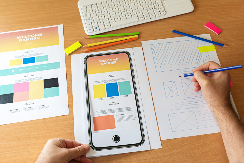
Usable
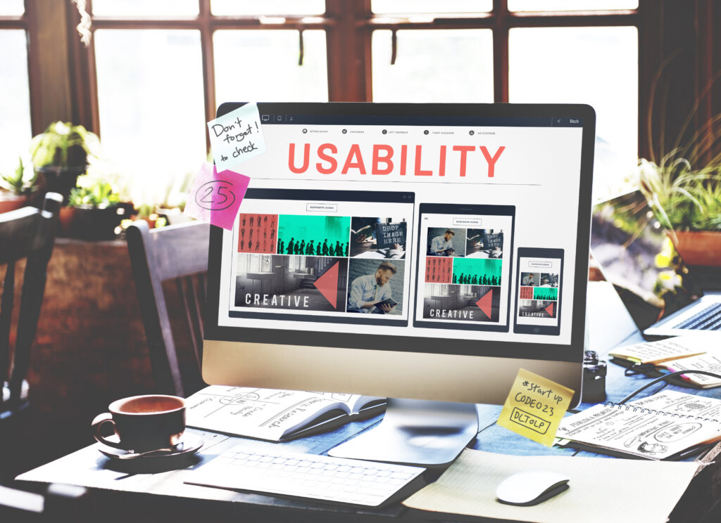
We often encounter such criterion as usability when we speak of user experience and UX design. Indeed, it is important to make the user journey as smooth and comfortable as possible. To achieve this, you need to pay attention to the ease of use and ease of understanding of the content of the page.
To make the page comfortable for users, go with the less is more rule. Use fewer flashy banners and go for a moderate color palette. However, it is also essential to make the important bits like CTAs stand out, contrasting colors are good for this.
image source: https://www.reynders.com/en/how-we-work
So, there is no better way to describe it as balancing on the verge of keeping the sharp and fresh contrasts without making your eyes water. In short, this is an approach you should avoid:

image source: https://chasemor.files.wordpress.com/2010/11/baddesign.jpg
Usability also adds to device optimization: for instance, if you drive mobile traffic it is better to make all the actionable menus, buttons, and such in the lower part of the screen to make it easier for users to tap and scroll with one hand. Also, don’t forget to take the popular device sizes into account, the bigger the screen — the harder it is to reach the top and the opposite side.
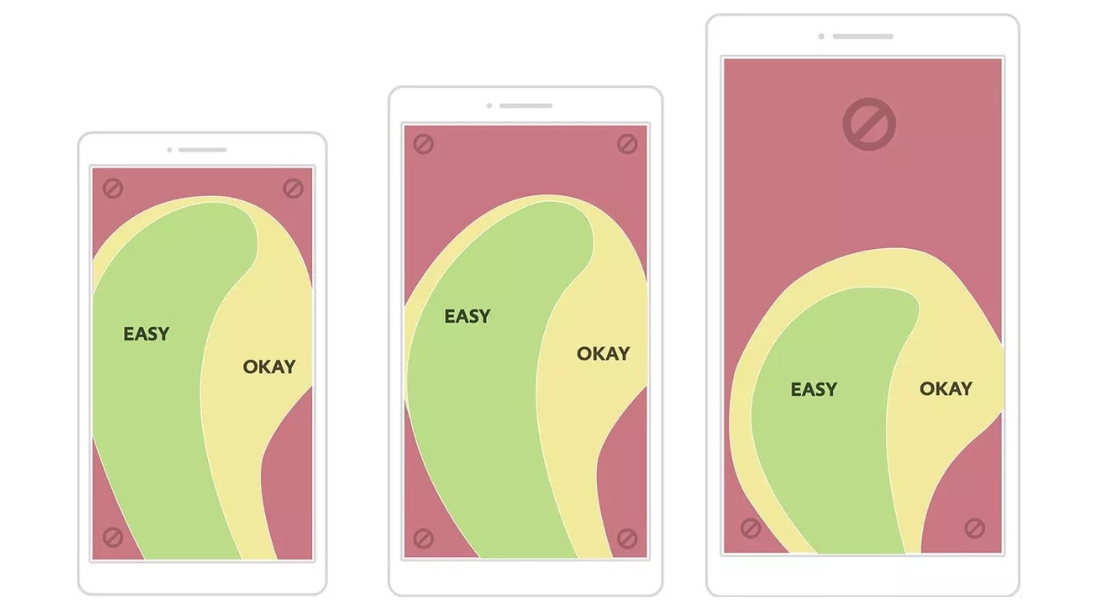
image source: https://www.practicalecommerce.com/mobile-site-pass-thumb-zone-test
Check out these resources for more valuable insights on mobile application design and website UX principles that make killer landers.
Intuitive
This point is also closely linked to user comfort and means that your landing pages should be as user-friendly as you can master. It should be easy for the audience to navigate the page(s) and find important information. One way to do this is placing the best (and most convincing) bits above the fold. This idea comes from traditional news publishing and means that the hottest and the most sensational headlines went on top of the first page and remained visible even when the newspaper was folded in half. For a modern website, this principle works like this:
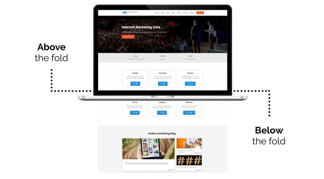
image source: https://imu.nl/internet-marketing-kennisbank/webdesign/above-en-below-the-line/
Being intuitive also means choosing the words that convey your ideas in the best possible way. Use simple language, but also consider your audience’s background: don’t talk rocket science to teenagers and avoid baby talk with rocket scientists. Keep it adequate and relatable.
Related to language choice, it’s also important to mention website localization. Never use machine translation for your landing pages, while it may seem okay to you, native speakers will see the sloppiness and will not appreciate it. This attitude undermines user trust and makes your pages look less authentic. Online translation agencies are many and diverse, you can start by searching for One Hour Translation Services and such. It is always better to use the services of native translators, but if you are on a shoestring budget, at least go for certified professionals. By the way, there is a lifehack: not all native speakers of English come from the UK and US, or French — from France. If you need a translation into English or French, for instance, search for native speakers from African countries. By that we mean that there are less obvious countries with the same primary language and lower prices, so you can save money on localization.
Persuasive

And finally, the goal of a landing page is to convert, so use elements that add to the persuasion. Social proof and UGC (user-generated content) like testimonials, unboxing videos, and reviews — sometimes work wonders for convincing the undecided visitors. You can also provide contact information (for lead generation offers), shipping terms (for nutra and e-commerce), legal quotations (for betting and gambling), or a Q&A section (for almost any vertical).
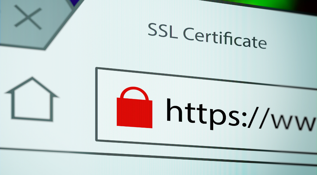
Another important asset of trust for a website is an SSL (Secure Sockets Layer) certificate which ensures the site’s identity and creates an encrypted connection with a server. This certificate makes sure that user’s data is protected from leaks or cyber attacks, and users are more likely to stay and browse on a secure website. In this article, you can find out more about free ways of getting an SSL certificate for your landers and gaining more leverage with your audience.
Another great way to push a visitor towards a purchase is making your offer limited, either in quantity or timing. Ticking timers and only this week banners can trigger that modern fear of missing out (FOMO) and tip the scales in your favor.

image source: https://cdn.dribbble.com/users/3587/screenshots/2214362/dribbble_preview.jpg?compress=1&resize=400×30
Do’s and don’ts

So, here is a checklist for you to make your landers as lean as possible and hit your conversion goals.
✓ Make sure you speak the same language as your audience, consider users’ background and lifestyle.
✓ Go for leaner webpages that are not overloaded with flashy elements.
✓ Provide users with evidence and social proof: UGC, reviews, unboxing, video, and real-life pictures of the product.
✓ Use high-quality copy and translations.
✓ Monitor your landers’ loading speed and optimize accordingly. Use CDN tools to make sure the best content retrieval speed.
✓ Check your site’s adaptability for different devices, users should be able to access it regardless of the size, age, and capacities of their devices.
✓ Make it your task to collect an email database as a side project, this will become a valuable asset for email marketing campaigns.
✓ Implement urgency tactics with limited offers and timers on your site.
✓ When relevant, implement upsells — they can yield impressive results with nutra, e-commerce, and online education, for example.
✗ Don’t be wordy, a long-read rarely sells but it usually bores.
✗ Refrain from using too many clashing colors and bright elements on one page.
✗ Forget about machine translation, if you want cheaper localization services, search for native speakers from Tier-3 countries.
✗ Don’t go heavy on notifications and pop-up elements, they can be annoying and disruptive for the user experience.
✗ Don’t think that only ugly works. Sure, there is some fascination in weird design choices, but more often a well-designed website performs better.
Conclusion
Modern users have many options and opportunities, which makes it harder to convert them into paying customers. This is why investing in the quality of landing pages is crucial for the overall performance of your campaigns. Bear those five points in mind and stay on top of your affiliate game. And if you need any advice or assistance with your landers, don’t hesitate to contact Yep Ads managers!