

How to Design Converting Landing Pages
If the creative is the first frontier of an ad campaign, then the landing page is the primary weapon. Sparking interest is not the main objective of a lander, rather it must be convincing and cohesive (with the creative and the offer). And, of course, most of all it must be converting. Today we will talk about what a converting lander looks like and how you can make such landing pages for any offer vertical.
When it comes to design, there are two major routes one can go: graphic design and functional design (we can call it UX). We will take a look at both options.
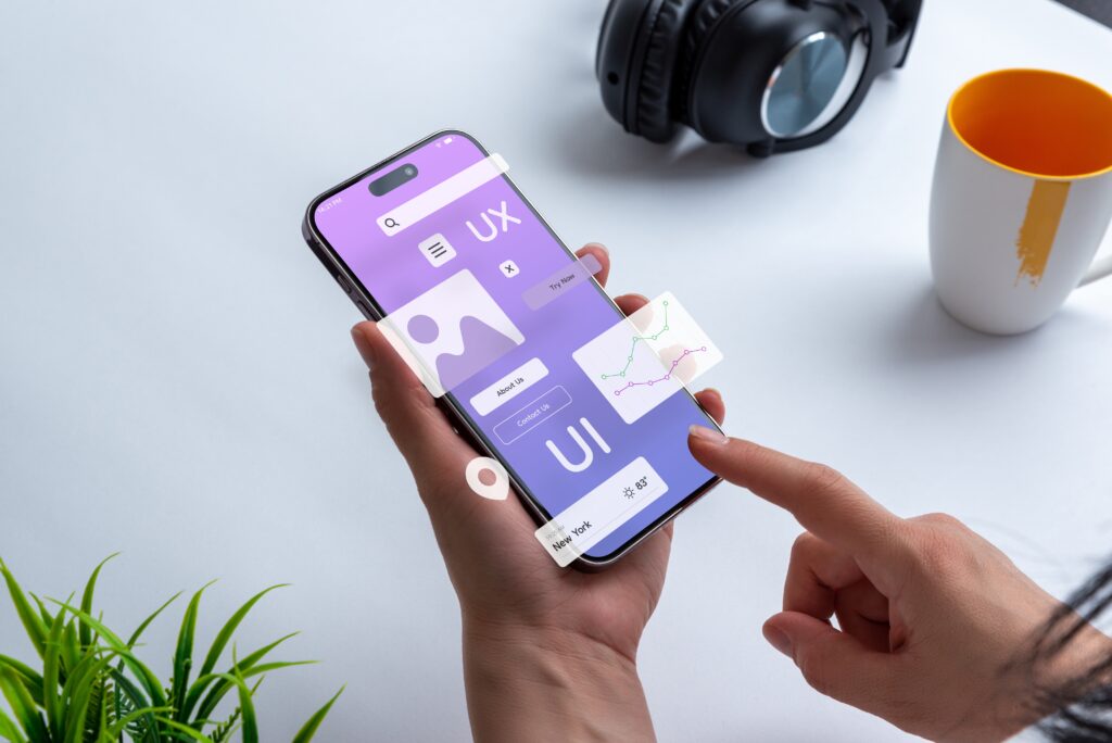
UX design
AI, VR, and the Metaverse
These are not just a bunch of smart terms that you see everywhere nowadays. By now, AI-generated content, augmented reality, and virtual shopping have become a new reality for many Internet users. We see numerous brands that integrate VR tech into their marketing strategies: Nike with their NIKELAND game or Wendy’s with a virtual diner in their metaverse.
This trend stems from the idea of inclusivity and presence when users can be a part of the experience or become closer to the brand. These interactive elements allow marketers to showcase the product, announce the company’s vision, and keep in close contact with the target audience at the same time.
For a more down-to-earth website of a smaller brand, this can be done in the form of a QR-code navigation system: scan the code to unlock the content or go to a different section of the site. Or an AI assistant that provides the Q&A and basic information about the product.
These options are the most cutting-edge on our list, this is why this design trend will be a good choice for products aimed at the younger target audience: games, subscriptions, and some e-commerce goods. Young people love and support the novelty of such formats, while people over 50 may not be inclined to chat with AI or scan any codes.
Animation and interactivity
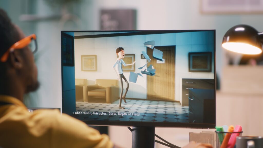
Sure, static pictures have their value and work better for more subdued products that require careful consideration (finance services, home renovation, automobiles). However, more and more brands choose video and animation as the best medium to talk to the audience.
To say the least, video does a better job of showing the product from all angles and allows the seller to present the product “in action”. Imagine an ordinary photo versus a video of a model walking and swinging to show how the dress moves. Also, video and animation allow incorporating the company style, color palette, and tone of voice better than static formats.
What you can incorporate into your websites:
- Animate the cursor: make different versions of the cursor for various occasions. It can correlate with the theme of the product (women’s clothing, toys, home decor) or stage of the funnel (browsing, checkout, payment). Only make sure, it does not get in the way of interacting with the website. Check out more examples of cool cursor animation on Hubspot.

Via Hubspot
- Download/loading animation: no user wants to wait too long, but if you can’t change the size of the files or the Internet speed, at least make this waiting more agreeable.
Via awwwards
When we think of animation, we must not forget about the size of source files and, consequently, the speed of the website. This is why such landing pages would work best for GEOs that have fast and stable Internet connection.
404 playground
The times when 404 error pages were a dead-end destination are in the past: now this is another way of interacting with the audience. It’s no news that it’s better to style the 404 page in keeping with the main theme of the website and to add a bit of humor, too: users don’t like seeing errors instead of content, so a kind joke wouldn’t go amiss.
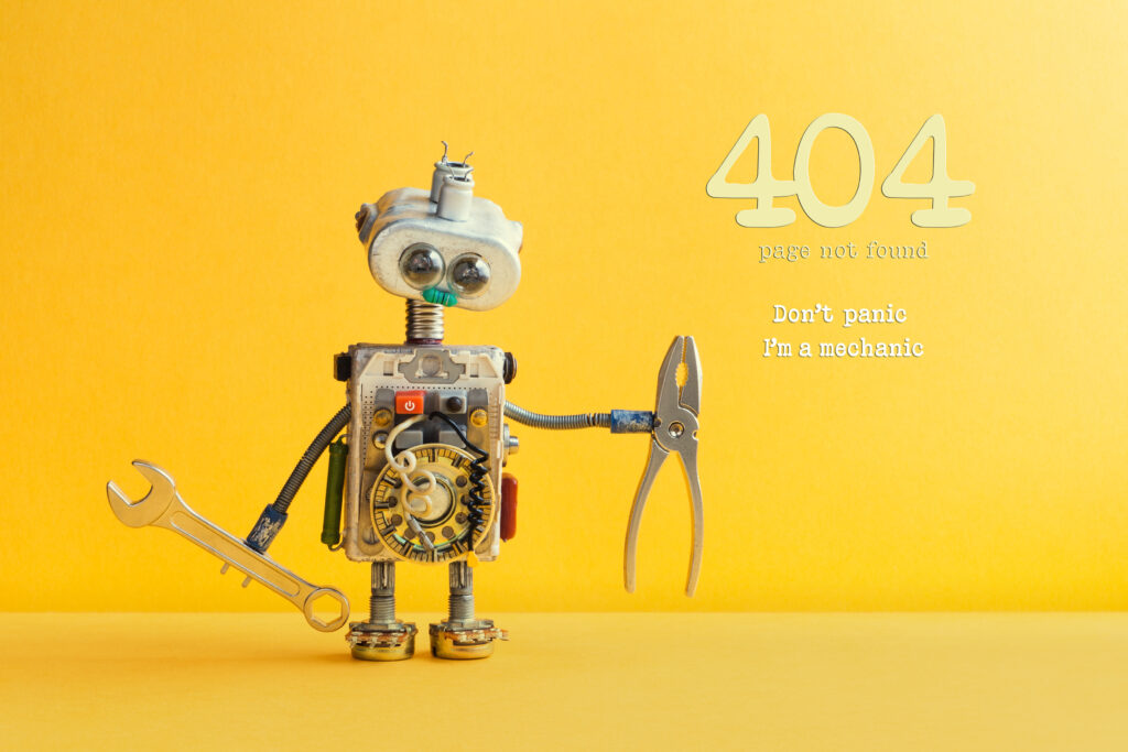
However, you can take it a step further and create a fully entertaining experience where people mostly expect disappointment. Mini-games and additional information about the product presented playfully may become the key to the users’ hearts. Take a look at this selection of top 404 page designs from Time.
Such a strategy is bound to attract the attention of the users, regardless of their age. The selection of suitable offer verticals is also wide: digital products such as games, info products, and utilities will be the best choice; e-commerce and nutra are also good options since light distractions in the form of mini-games will not disrupt the shopping experience; verticals that demand more focus from the users (finance, medical, or insurance) will do better without mini-games, but a creative 404 page will not be a waste of time.
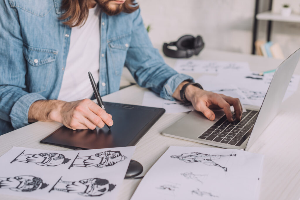
Graphic design
Visual overload
Intuitive navigation, clear layout, and smart use of negative space have dominated the visual design world for many years. It makes much sense from a user’s perspective, because a minimalistic website does not overwhelm you with heavy details, gives important information piece by piece, and seems to guide you with its structure.
However, it’s quite difficult to stand out when all sites are minimalistic and intuitive. This is when visual maximalism steps onto the stage: little to no negative space, a jumble of elements, and no clear structure. This expressive rebellion will definitely make an impression. But it’s up to you to decide if this style fits your campaign goals because it can definitely work for an e-comm or subscription product, while the CR for lead generation and info products may suffer from the lack of clarity and structure.
No-grid layout
Historically, the layout is a cornerstone of any web page: neat blocks and rows that create the bigger picture. It turns out, this structural element, though common, is not indispensable. A trend for overlapping elements has emerged lately, and it can give your website a distinctive look that will make users stick longer.
This trend includes not only pictures and additional design elements (lines and figures), but also text (sometimes to the verge of legibility). An important thing to keep in mind if you are going to use this trend: don’t sacrifice meaning for the look. Mind the text and make it visible, use bold, italics, or underlining to keep things legible.
3D models
Even though the animation and interactive formats are on fire in 2022, we shouldn’t forget about 3D voluminous figures. This can be a depiction of a company’s logo, mascot, or the product itself. Alternatively, this can be a picture of “a happy customer” — one more way to get across the product’s unique value (USP).
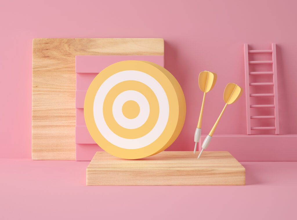
3D Illustration. Yellow target and darts on pink pastel color background. Success concept.
It all depends on the product, vertical, and overall design of the website, but in some cases, 3D images look more impressive than cutting-edge animation. Besides, this can be a way to cut the costs: one 3D design often costs less than a high-quality video or an animated sequence. Another positive side: these figures are easier on the human eye since they resemble real life more, and it’s easier to relate to these characters.
Conclusion
Web design trends change every year just like high fashion, and just like fashion they live in cycles and tend to swing back from time to time. New trends you see here or anywhere else are just that — a tendency that may play in your favor, not a set of rigid guidelines. So, it is worth knowing the latest fashions, but it’s up to you whether you should use these ideas in your work. And when in doubt, reach out to the pros from the Yep Ads team!
You Might Also Like
- How to build a converting landing page
- User Psychology for Affiliates: Attention-Grabbers and How to Make Them Convert
- Conversion Rate Optimization: How to Build Smarter Campaigns in 2026
- Split Testing – is it worth it?
- How to Optimize Your Affiliate Marketing Campaign the Smart Way
Share
